Using the Crowdin Logo
We encourage you to check out the following guidelines that provide clear instructions and standards for using our logo, color palette, and other design elements.
Logo
The full version of the Crowdin logo is for use on the web and in printed materials.
Stacked Logo
This version is used for optimizing vertical space.

Mark
Use the logo mark only where space constraints don’t allow the horizontal full version logo.
Preserve the correct logo spacing to maintain visual balance and keep the logo proportional.
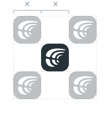
- Allow correct white space
- Keep the logo sharp by choosing the proper resolution
- Use light neutral backgrounds
- Keep the logo easily visible
- Don’t alter the logo in any way
- Don’t add drop shadows
Below are examples of how to use the Crowdin logo when it is inscribed in different shapes, such as circles or squares. The alignment of the logo is achieved visually, considering the asymmetrical shape of the mark.
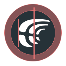
Logo in a Round Shape
To place the logo in a round shape, use visual alignment by placing the logo approximately 5-8% to the right. Ensure that the logo is scaled proportionally, making it 20% smaller than the background area.
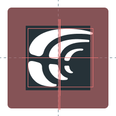
Logo in a Square Shape
When placing the logo in a square shape, use visual alignment by placing the logo approximately 5-8% to the right and make it 25-30% smaller than the background area.
Color examples
cDark
Hex: 263238
RGB: 38 50 56
Pantone: 433 CP
cWhite
Hex: ffffff
RGB: 255 255 255
Pantone: P 179-1 C
Examples of the correct use of the logo on plain surfaces and photos.
Examples of the incorrect use of the logo, not maintaining proportions, using the wrong logo color, etc.
Avoid Using the Old Crowdin Logo
Avoid Stretching
Avoid Low Contrast
Using on Busy Background

Use the badge when you want to show our partnership or let others know that you use Crowdin to localize your own project.


DOWNLOAD
.zip (all badges)
Brand Guidelines
Explore our guidelines for properly using and applying our brand’s visual elements.
Download Brandbook